Blog Layout and architecture
The nine sections every landing page has now
Hero, logo bar, three feature cards, stats, testimonials, pricing, FAQ, CTA, footer. Where that running order came from, why generators reproduce it exactly, and how to tell a structure from a habit.
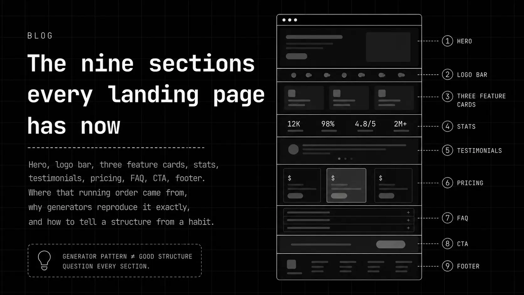
Open a new software landing page and you can predict the scroll before you do it. Hero with a centred headline. A row of customer logos. Three feature cards. Some big round numbers. Testimonials. Pricing. An FAQ nobody asked. A closing call to action that repeats the hero. Footer.
That's nine sections in a fixed order, and the detector here fires when five of them show up together. It's worth 12 points, one of the heavier layout tells, and the note it prints is deliberately blunt: every section present, none earning its place.
Where the running order came from
It wasn't invented by a model. It was assembled over about fifteen years of conversion optimisation, and most of the individual pieces genuinely worked when they were introduced. Social proof above the fold raises conversion. An FAQ intercepts the objection that would otherwise cost you the sale. A closing CTA catches people who scrolled past the first one.
What happened next is the interesting part. The order got copied often enough that it stopped being a set of decisions and became a template, and once it was a template it became the single most reproduced page structure in the training data. Ask any model for a landing page and this is what comes out, because this is overwhelmingly what a landing page looked like in everything it read.
The pieces the scanner counts separately
Three feature cards in a row is worth 8 points on its own. The note gets at the actual problem: features arrive in threes as tradition demands, regardless of how many things the product does. Almost no product has exactly three things worth saying. Cloudflare's homepage trips this one.
A pill badge above a centred H1, followed by a centred subhead and two buttons, is 11 points, described in the code as the most reproduced opening in the training set. Everything centred fires at six or more centred blocks and is worth 7; Cloudflare has 15. Long centred text is measurably harder to read, and with nothing left-aligned to anchor against, the hierarchy flattens into one undifferentiated column.
The bento grid is the newest arrival and the lightest at 5 points, firing at four or more asymmetric spans. The test the note proposes is a good one to apply yourself: if shuffling the tiles changes nothing, the asymmetry was decoration. Stripe, Notion, Framer, and Cloudflare all trip it, which tells you this is a current fashion rather than a generator artefact.
The two that are about honesty, not layout
Statistics nobody measured is 13 points, the heaviest in the category. It looks for round, unsourced numbers of the 10,000+ companies and 99.9% uptime variety, and it fires at two or more. Stripe, Webflow, and Cloudflare all trip it. Round and unsourced is the whole signal: real measurements are rarely round, and the ones that are usually come with a footnote.
A trusted-by bar with nobody in it is 12 points, and it's the one on this list that shades from lazy into dishonest. It fires on logo bars whose contents are placeholders, unnamed, or greyed-out stand-ins. Framer trips it. There's a real difference between customers you have and a row of grey rectangles arranged in the shape of customers you'd like.
The skeleton is not the problem. Reaching for it before knowing what the page has to say is the problem.
Why good sites trip this too
Basecamp trips the template skeleton with five of the seven stock sections, and Basecamp scores 7 out of 100, comfortably hand-written. That's the correct outcome. Basecamp has customers, has pricing worth stating plainly, and has been arguing about landing page structure publicly for two decades. Using a familiar order because it works is not the same as using it because it was the default.
The scanner cannot see that difference and does not pretend to. Layout tops out at a category cap of 45 in the scoring, the second-lowest of any category, precisely because structure is weak evidence about intent.
How to tell yours apart
- Delete a section and see what breaks. If nothing does, it was there because the template had one, and the page is better without it.
- Count your feature cards. If it's three and your product does five things, you cut two things to fit a grid. Pick the layout after the content, not before.
- Check every number on the page for a source. If a stat is round and you cannot say where it came from, either find the real figure or remove it. The real one is more persuasive anyway, because it looks measured.
- If your logo bar contains anyone who is not actually a customer, take them out. This is the one tell here that can turn into a legal problem rather than a design problem.
- Try left-aligning your body copy and keeping the centring for the hero alone. It's a one-line change that fixes readability and the flattened hierarchy at the same time.
Checking whether your own page does this takes one paste, not a manual audit.
Scan a page for this signal →