Blog Human craft
How to make an AI-generated website look hand-built
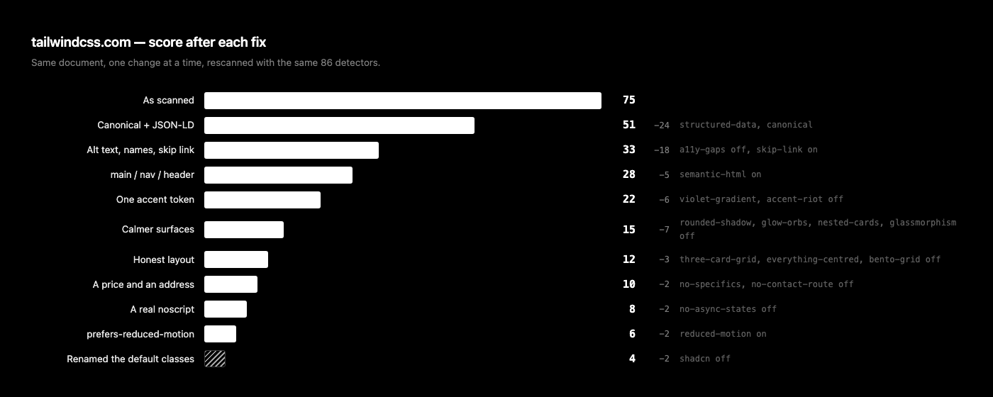
We took the page from our first scan run that came back highest, fixed it one change at a time, and rescanned after every fix. 75 to 4, with the exact reason for each drop.

The first thing we did with this scanner was point it at 28 public homepages and publish every result. Six deliberately old sites, a dozen modern product pages, and the AI builders themselves. Most landed in the teens. One came back 75, which puts it in the top band: "Shipped straight from the chat window."
It was tailwindcss.com. Their own homepage, built by the people who wrote the framework, and definitely not generated by anything. That is the useful part. The scanner reads artefacts, not intent, and it cannot tell a default someone chose from a default someone accepted. So the 19 signals it found on that page are a clean set to work through: the same tells your generated page has, on a document nobody can accuse of laziness.
We rescanned it before writing this. Still 75, on a fresh 900 KB fetch. Then we took the actual HTML, fixed one category at a time, and ran the same 86 detectors after every change.
What the scan found
tailwindcss.com — the 16 signals pushing the score up
| Signal | Weight | What was actually there |
|---|---|---|
| The indigo-to-violet gradient | +15 | from-purple-600, from-pink-500 and neighbours |
| shadcn/ui class signatures | +12 | 2 untouched utility signatures |
| Accessibility gaps | +12 | 2 images with no alt, 1 icon-only button with no name |
| Copy that never says who it is for | +9 | 1,266 words, no price, no contact route, no named audience |
| No way to make contact | +9 | No mailto:, no tel:, no form, no /contact link |
| rounded-2xl and a soft shadow on everything | +8 | 33 extra-rounded cards, 7 oversized shadows, 0 hairline borders |
| Glowing orbs on a dark ground | +8 | 24 glow surfaces |
| Cards inside cards | +8 | 14 card surfaces nested in other card surfaces |
| Exactly three feature cards | +8 | 5 md:grid-cols-3 declarations |
| Dependency sprawl | +8 | 16 script files, 2 third-party asset hosts |
| Backdrop blur everywhere | +7 | 9 blurred surfaces |
| Four accent colours competing | +7 | 8 hues at the same volume |
| Everything centred | +7 | 38 centred blocks |
| Only the happy path was built | +7 | No loading, empty or error state anywhere, not even a <noscript> |
| The database addressed from the browser | +6 | Supabase queried client-side |
| A bento grid | +5 | 21 multi-column spans |
Three craft signals pulled back against that: an authored social preview, 69 ARIA attributes, and 319 CSS custom properties. Net evidence of 103 against 22, which the curve maps to 75.
The rules we set ourselves
Same document throughout. One category of change at a time, rescanned after each. And no renaming things purely to dodge a regex: every edit below is one we would defend in a code review, which matters because a scanner is trivially gameable and gaming it teaches you nothing.
Metadata: two lines, 24 points
This is the one that surprised us. The page had no canonical link and no JSON-LD. Adding a canonical tag alone took it from 75 to 65. Adding structured data as well took it to 51.
<link rel="canonical" href="https://tailwindcss.com/" />

<script type="application/ld+json">
{
  "@context": "https://schema.org",
  "@type": "SoftwareApplication",
  "name": "Tailwind CSS",
  "applicationCategory": "DeveloperApplication",
  "offers": { "@type": "Offer", "price": "0", "priceCurrency": "USD" }
}
</script>
Those two tags are worth 10 points of craft between them, so where did the other 14 come from? Craft damps the aesthetic, copy and layout categories. The more deliberate work a page shows, the less its gradients are allowed to say about it. Going from three craft signals to five tightened the damping factor, and the positive evidence fell from 103 to 81 without a single gradient being touched. Cheapest fix on the page, and it is the one people skip because it is invisible.
Accessibility: alt text, button names, a skip link
Two images shipped with no alt attribute and one icon-only button had no accessible name. Three omissions, 12 points. We wrote real alt text rather than empty strings, because an empty alt on a content image is a different bug wearing the same clothes.
- <img src="/_next/static/media/dark-mode.dark.png" />
+ <img alt="The same dashboard rendered in dark mode"
+      src="/_next/static/media/dark-mode.dark.png" />

  <body>
+   <a href="#main" class="skip">Skip to main content</a>
The skip link is worth 9 on its own. It takes one anchor and four lines of CSS, and no generator has ever written one unprompted, which is exactly why it counts for so much.
Landmarks: the page had no main element
A 900 KB homepage with a footer, some sections, and no header, no nav, no main. Screen readers navigate by landmark; without them the whole document is one undifferentiated region. Adding three tags moved it from 33 to 28.
<header>
  <nav aria-label="Primary"> ... </nav>
</header>
<main id="main">
  ...
</main>
<footer> ... </footer>
Colour and type: pick one accent and mean it
Eight accent hues at equal volume, and the purple gradient built out of the framework's own palette. The fix is not to abandon purple. It is to spend the colour budget once, name it, and reuse it, so the accent reads as a decision instead of whatever the utility list offered.
/* before: eight hues, none of them chosen */
from-purple-600  via-pink-500  to-indigo-400
bg-sky-500  text-emerald-500  border-cyan-500

/* after: one token, defined once, reused everywhere */
:root { --brand: oklch(0.62 0.19 264); }
.from-brand { --tw-gradient-from: var(--brand); }
That killed two signals at once: the gradient (15) and the accent riot (7). Typography followed the same logic. The page already self-hosts its fonts, which is the part most generated pages get wrong, so there was nothing to fix there.
Surfaces: stop putting a box around everything
33 extra-rounded cards, 7 oversized shadows, 9 backdrop blurs, 24 glow surfaces, and 14 cards sitting inside other cards. None of it is wrong in isolation. All of it together means nothing on the page reads as more important than anything else, because every element got the same treatment.
We flattened the nesting, dropped the blur, and replaced the blanket rounded-2xl and shadow-xl with a single card class used only on things that are actually cards. Four signals died at once and the score went from 22 to 15.
Layout: 38 centred blocks
Centred text is measurably slower to read at length, and with no left-aligned anchor the hierarchy flattens. The three-column grid appeared five times regardless of how many things there were to say. The bento grid used 21 multi-column spans as decoration rather than emphasis. Fixing all three took 15 to 12.
The test for a bento grid is simple: shuffle the tiles. If nothing gets worse, the asymmetry is not carrying meaning and a plain grid will read better.
Copy: a price and an address
1,266 words that ask for the sale and never name a price, an audience, or a way to reach a human. Two signals, 18 points combined, and on a small business site this is the whole failure rather than a style note.
<address>
  <a href="mailto:hello@example.com">hello@example.com</a>
</address>
One mailto: satisfies both detectors. That feels cheap until you notice it is also the single most common reason a generated business site never converts.
The last three: 10 to 4
- A real <noscript> with a working fallback, which cleared the "only the happy path was built" signal (10 to 8).
- A prefers-reduced-motion block, worth 8 points of craft (8 to 6).
- Renaming the leftover shadcn defaults to classes that describe the component rather than the library (6 to 4).
The rescan, and why the number moved
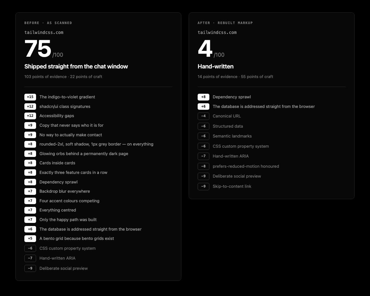
75 to 4, from the top band to the bottom one. The mechanism is worth being precise about, because "we fixed some stuff and the number went down" is not a lesson anyone can reuse.
Two things happened at once. The obvious one: 16 positive signals became 2, so the raw evidence collapsed. The less obvious one: every craft signal we added tightened the damping applied to the aesthetic, copy and layout categories, so the signals that were still there counted for less on the way out than they had on the way in. That is why the metadata fix was worth 24 points when the tags themselves are only worth 10. Craft is not just points. It changes what the rest of the page is allowed to be accused of.
The curve does the rest. It saturates, so the first tell moves the needle far more than the tenth, and the same asymmetry runs in reverse when you start removing them. Going from 19 signals to 10 is not a 47% improvement. It is most of the distance.
What we did not fix, on purpose
Two signals survived, and both should have.
- Dependency sprawl, +8. 16 script files is a build decision, not a markup one. You cannot sed your way out of it and pretending otherwise would have been dishonest.
- The database addressed from the browser, +6. Supabase is queried client-side. That is not proof the row-level security is off. It is the reason to go and check, and one HTML fetch cannot do that for you.
A page sitting at 4 with two real architectural notes is a much better outcome than a page at 0 with the evidence hidden. The scanner is a heuristic over one HTML document with no JavaScript executed and no repo access. It cannot see whether your nav links resolve, what your Lighthouse numbers are, or whether the form posts anywhere.
The score measures how much your page looks like the defaults. It does not measure whether your page is any good. Those correlate more than anyone would like, which is the only reason it is worth checking.
Two categories never fired on this page, so we should say where they show up instead. Fixed pixel widths that overflow a phone hit base44.com in the same run, the highest scorer in the set at 82. Dead navigation is a webflow.io problem: 26 anchors pointing at href="#" on one page. Check both on yours even though they are absent here.
The checklist
Ordered by points recovered per minute spent, which is roughly the reverse of the order people attempt them in. The first four take under an hour between them and are worth more than the entire visual redesign most people start with.
- 1. Add a canonical link. One tag. It moved this page 10 points on its own.
- 2. Add JSON-LD for what the page actually is: Organization, Product, LocalBusiness, Article. Not all four.
- 3. Write a real meta description and an authored Open Graph title and image.
- 4. Add a skip-to-content link. One anchor, four lines of CSS, 9 points, and no generator has ever written one.
- 5. Give every content image real alt text. Decorative images get alt="", and knowing which is which is the whole skill.
- 6. Give every icon-only button an aria-label. Grep for <button> with no text between the tags.
- 7. Wrap the page in header, nav, main and footer. Most generated pages have footer and nothing else.
- 8. Add a prefers-reduced-motion block that kills your animations. Eight points, and somebody out there needs it.
- 9. Pick one accent colour, define it as a token, and use it in at least three places. Purple is fine. Unchosen purple is not.
- 10. Count your rounded-2xl and shadow-xl declarations. If the number is over ten, you are decorating rather than ranking.
- 11. Un-nest your cards. A card inside a card means the hierarchy was never decided.
- 12. Count your text-center blocks. Over six and the page has no reading anchor.
- 13. Put a price, a named audience, or a mailto: on the page. Any one of the three. Preferably all three.
- 14. Add a noscript and a real error state. Slow network and failed request are not edge cases.
- 15. Grep for href="#" and for fixed pixel widths over 400px. Both are leftovers, and both are visible to anyone who opens the page on a phone.
None of that is a redesign. It is about two hours of work, most of it in the head element and the attributes you already have. The page you generated is probably closer to hand-built than it looks; it is mostly missing the parts nobody thinks to prompt for.
Checking whether your own page does this takes one paste, not a manual audit.
Scan a page for this signal →