Blog Colour, type and surface
Does UI/UX Pro Max actually improve AI-generated design? Our before-and-after test
We gave the same model the same brief twice, once cold and once with an open-source design skill loaded, then scored both pages with this site's own scanner. 97 to 11. Here is what moved, and the four things the skill did not fix.
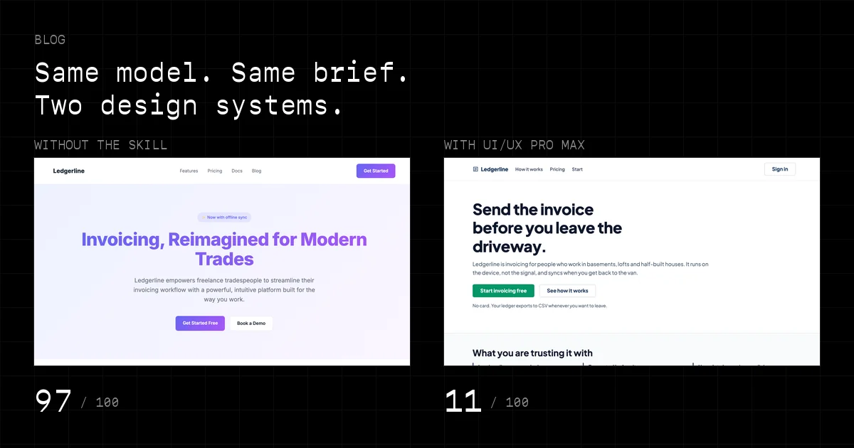
Every signal this scanner looks for comes down to the same complaint: a decision nobody made. The gradient that came with the framework. The typeface that came with the tutorial. Nine sections in the order the template listed them. Which raises a fair question. If a model reaches for defaults because it has nothing better to reach for, what happens when you hand it a design vocabulary first? That is roughly what UI/UX Pro Max is built to do, and it is open source, so you can go and read the thing before you believe any of this.
We tested it properly. One model, one brief, two builds, and this site's own detector engine as the referee. The score went from 97 to 11 and the verdict flipped from generated to hand-written. That is the headline, and it is also the least interesting part, because four things did not improve at all and one of the skill's own recommendations fails its own checklist.
The problem, stated precisely
AI coding tools produce interfaces that work. What they repeat is everything nobody spent attention on. The indigo-to-violet gradient. Three feature cards. A stats row with numbers somebody invented. Centred text all the way down. Inter, because Inter is what the tutorial used. No skip link, no focus ring, no meta description. None of those is a crime on its own. Together they are the fingerprint of a page assembled out of defaults, which is exactly what this site's 86 detectors are counting.
What UI/UX Pro Max actually is
It is not a prompt file. Underneath it is a stack of CSV files and a Python search layer that ranks rows with BM25, wrapped so a model can query it. Give it a product description and it hands back a landing pattern, a visual style, a colour palette, a font pairing, an effects profile, a list of anti-patterns and a pre-delivery accessibility checklist. You can also query one domain at a time (style, colour, typography, landing structure, UX guidelines, charts), and there is stack-specific guidance for React, Next.js, Vue, Svelte, SwiftUI, Flutter and the rest.
The repository currently advertises 79 searchable styles, 192 product types and palettes, 74 font pairings, 119 UX guidelines and 22 technology stacks. The copy we had installed dates from 21 July 2026 and reports smaller numbers in its own manifest: 67 styles, 161 palettes, 57 font pairings, 99 UX guidelines. So everything below came out of that older snapshot. Worth knowing before you compare our results with yours.
How we tested it
Same model both times, Claude Opus 5, in one session. Same brief: a landing page for Ledgerline, an invented invoicing app for freelance tradespeople. Same constraints: one self-contained HTML file, inline CSS, no build step, no JavaScript. The trades framing was deliberate. The default startup palette is obviously wrong for a plumber's invoicing app, so a mismatch becomes something you can see rather than something you argue about.
- Version A was written first, in a single pass, before the skill was loaded into the session at all. Then it was frozen and never touched again.
- Only after that did we run the skill, capture its raw output, and build version B from that alone. Nothing was added that the skill had not recommended.
- Both files were scored locally against this site's own lib/scoring.js, so the numbers come from the same 86 detectors that run on any URL you paste into the homepage.
- Both were captured full-page in headless Chrome using real device emulation at 390px rather than a narrow window, then audited for focusable elements, labels, focus rings and contrast ratios.
One caveat worth carrying through the rest of this. Version A was written by the same model that later graded the experiment. We did not set out to make it bad, and we also cannot prove we did not write a straw man without noticing. What we can say is that its signals are the ordinary ones. The same detectors fire on real sites every day, and every number below is reproducible from the two files.
The baseline: 97 out of 100
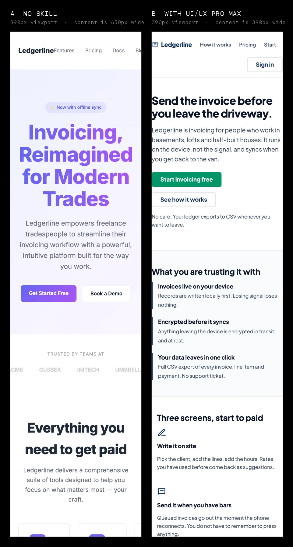
Version A scored 97, which lands in the top verdict band: "Shipped straight from the chat window". Eighteen detectors fired for 196 raw points, and not one craft signal fired to damp them. The page ran 4,343 pixels tall on desktop. On a 390px phone the height was not the problem. The content measured 650 pixels wide, so a quarter of every section sat off the right edge before anyone had read a word.
Version A: where the 196 points came from, by detector category.
| Category | Points | The heaviest single tell |
|---|---|---|
| Copy tells | 61 | Template placeholder text still in place (18) |
| Colour, type and surface | 49 | The indigo-to-violet gradient (15) |
| How it behaves | 30 | A form that submits into the void (14) |
| Leftovers | 25 | 19 anchors pointing at href="#" (10) |
| Layout and architecture | 19 | The standard landing page skeleton (12) |
| Source and build | 12 | Section comments left in production (12) |
| Human craft | 0 | Nothing fired |
The accessibility audit came out worse than the score. Nineteen of the twenty-one focusable elements pointed at href="#". The newsletter input had a placeholder and no label. No skip link, no focus-visible rule, no reduced-motion block. Five of the six text-and-background pairs we measured came in under 4.5:1, including the gradient-clipped headline at 3.69:1 against its own background, and white on the primary button at 4.23:1.
What the skill actually recommended
We ran the design-system generator twice, with two different phrasings of the same product.
Query 1: "invoicing app for freelance tradespeople landing page"
  PATTERN     App Store Style Landing
              Sections: hero with device mockup, screenshots carousel,
              features, reviews/ratings, download CTAs
              CTA: App Store + Play Store buttons throughout
  STYLE       Vibrant & Block-based
              Best for: startups, creative agencies, gaming, social media,
              youth-focused, entertainment, consumer
  COLOURS     primary #1E3A5F  secondary #2563EB  accent #A16207
              notes: "Academic navy + gold keynote + track chips"
  TYPE        Outfit / Work Sans
  AVOID       Flat design without depth + Text-heavy pages

Query 2: "invoicing billing finance tool for independent contractors,
          trustworthy utilitarian, desktop and mobile web"
  PATTERN     App Store Style Landing        <-- unchanged
  STYLE       Accessible & Ethical
              WCAG AAA, focus rings 3-4px, skip links, 44x44px targets
  COLOURS     primary #1E3A5F  secondary #2563EB  accent #059669
              notes: "Navy professional + paid green"
  TYPE        Plus Jakarta Sans
  AVOID       Playful design + Poor security UX + AI purple/pink gradients
The style, palette and typeface all changed once we described the product more carefully, which tells you the output is only as good as the query you feed it. The anti-pattern line in the second run reads "AI purple/pink gradients", so the skill is naming the exact thing this scanner's heaviest aesthetic detector hunts for. And the layout pattern did not budge. It recommended an App Store landing page, device mockups and Play Store buttons included, for a web invoicing tool. Twice.
So we threw it out and searched the landing domain directly, which the skill supports. That returned "Trust & Authority + Conversion": hero stating the mission, then proof, then a solution overview, then one clear path to the CTA, with navy and grey and the accent held back for the button. Transparent pricing, low-friction form. That is the right pattern for this product and it was sitting in the database the whole time. The automatic match missed it. A query we chose found it.
The result: 11 out of 100
Version B was built from that output and nothing else. The Trust & Authority section order, the Accessible & Ethical style, the navy-and-green token set, Plus Jakarta Sans, 3px focus rings, a skip link, 44px touch targets, reduced-motion support, breakpoints at 768 and 1024. It scored 11, which reads "Hand-written". Four positive signals totalling 32 points, against five craft signals worth -36.
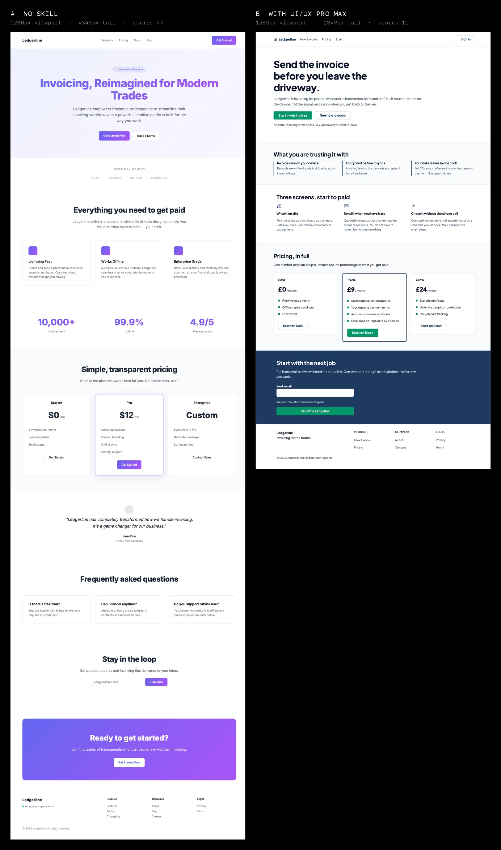
What changed, measured rather than described.
| Area | Without the skill | With the skill |
|---|---|---|
| Scanner verdict | 97 — Shipped straight from the chat window | 11 — Hand-written |
| Page structure | Nine content sections, six from the stock skeleton | Five, in the order the landing pattern specified |
| Hierarchy | Seven centred blocks, no left anchor anywhere | Left-aligned throughout, one measure per column |
| Typography | Inter, arriving as the default | Plus Jakarta Sans, from a matched pairing, still on our default-face list |
| Colour | Indigo-to-violet gradient; 5 of 6 text pairs under 4.5:1 | Navy/green tokens; 8 of 9 pairs pass, the accent itself does not |
| Mobile | 650px of content in a 390px viewport; 5,721px tall | Fits 390px exactly, breakpoints at 768/1024; 4,095px tall |
| Keyboard | No skip link, no focus rule, 19 anchors to href="#" | Skip link, 3px :focus-visible ring, 0 dead anchors |
| Forms | Placeholder-only input, submits nowhere | Visible label, described hint, real action |
| Motion | transform and opacity on hover, no reduced-motion | 180ms colour transitions, reduced-motion honoured |
What genuinely improved
The skill removed arbitrariness. It did not add taste. Every value in version B came from somewhere you can point at: the palette from a row, the pairing from a row, the section order from a pattern, the 3px focus ring from a style definition. Twenty CSS custom properties exist because the style asked for a token layer, and once the tokens exist the components stay consistent without anyone policing them.
- Five craft signals fired that had never fired before: skip link, reduced-motion, semantic landmarks, a token layer, and no utility-class soup. That is -36 points of deliberate decision-making the scanner can actually see.
- The page got 46% shorter on desktop and 28% shorter on mobile, because the pattern specified four sections and we stopped adding the rest.
- Contrast went from five failures out of six pairs to one out of nine.
- Nothing in version B is centred. That single change did more for the hierarchy than the palette did.
What the skill did not solve
Start with the pattern matcher, which was wrong both times. It recommended an App Store landing page for a web invoicing tool across two differently worded runs. Implement that without arguing and version B ships with a device mockup and a Play Store button on it. The good pattern was sitting in the same database; finding it took a person deciding the first answer was wrong.
Then the accent colour, which fails the skill's own checklist. The checklist says light mode text contrast, 4.5:1 minimum. White on the recommended #059669 measures 3.77:1. We only caught it because we ran the check the checklist told us to run, and the hover state we derived from it (#04795a, 5.4:1) turned out more readable than the resting state. Darkening the token to #047857 gets it to 5.48:1. The checklist works. The palette shipped with a value the checklist rejects.
The fonts are stranger. Both faces it recommended, Outfit in the first run and Plus Jakarta Sans in the second, sit on this scanner's list of typefaces that arrive as defaults, next to Inter, Geist, Poppins, Space Grotesk, Manrope and DM Sans. That is two tools genuinely disagreeing rather than a bug in either. The skill is picking a face that suits the product from a curated list. We are pointing out that the same eight faces turn up on everything. It is also the only aesthetic signal still firing on version B.
And the checklist has no metadata on it. Version B has no favicon, no meta description and no social preview image, because none of those appear anywhere in the pre-delivery list and we had committed to adding nothing the skill did not recommend. Those three account for 23 of the 32 points version B still carries. A design skill is a design skill. The head element belongs to somebody else.
Two more limits belong here even though they are ours rather than the skill's. Roughly a third of version A's evidence, 61 of 196 points, was copy: stock LLM phrasing, a weightless headline, "Your Company" left sitting in a testimonial. We rewrote the copy for version B, and the skill does not write copy. Another 37 points came from dead anchors and a form wired to nothing, which a static single-file demo earns almost by construction. So discount the headline number. The design-attributable share of the improvement is real, and it is smaller than 97-to-11 makes it sound.
A checklist cannot replace user testing, and a database cannot replace knowing the product. What it can do is make sure every value on the page came from somewhere.
The workflow we would actually repeat
- Write down the product, the audience and the personality first, in one sentence, before querying anything. The second query beat the first purely because it said trustworthy and utilitarian out loud.
- Generate a starting design system, then read it as a proposal rather than an answer.
- Reject whatever conflicts with the product. Ours proposed an App Store layout for a web app. Ten seconds to spot, an hour to undo.
- Run targeted searches for the parts the automatic match got wrong, the landing domain or the ux domain or the typography domain, instead of re-rolling the whole system.
- Implement one coherent direction. Half of one palette plus half of another is how you end up with an accent riot.
- Then actually run the checklist rather than reading it. Measure the contrast, tab through the page, load it at 390px. That is where we found the accent failure, sitting inside the skill's own recommended value.
- Score the before and the after with something that does not care about your feelings. We used our own scanner. A Lighthouse run and a contrast checker would tell you most of the same story.
So does it work
Yes, with every caveat above still attached. The score moved 86 points, the verdict band flipped, and the parts that did not move were either outside the skill's remit or artefacts of how we built the test. What improved was not taste.
UI/UX Pro Max does not give a model human judgement. It gives it a design vocabulary, a set of constraints and a checklist, which makes good decisions more likely and makes every decision far easier to review. The App Store pattern and the failing accent are the proof of that second half. The recommendations were wrong twice, and both times the wrongness was sitting in plain text where we could catch it in seconds. We will take that over a tool that is quietly right most of the time.
Checking whether your own page does this takes one paste, not a manual audit.
Scan a page for this signal →